Why product photography became the bottleneck
Ten years ago, a brand could live off one shoot for a whole season: twenty or so photos, reused on the website, in the catalogue and on a few posters. That pace is gone. Ad platforms reward variety: a visual that runs too long wears out, its cost per click climbs, and the algorithm keeps looking for new creatives to test against each other.
The result: a small brand needs dozens of visuals a month, in several formats, for several products. A photographer, a studio, a set and retouching for each one is out of reach. That is exactly where image generation changed the game: the product stays yours, everything else gets made.
The product stays yours. The set, the light and the layout get made.
But “generating an ad” means nothing until you understand what the model actually does with your photo. That is what separates a visual you can run from one where the bottle has changed shape and the brand name has a typo.
What an AI ad workflow really does
The principle fits in one sentence: take an ad whose staging works, and swap the product for yours. The composition, palette, lighting and typography of the original ad are kept; the model redraws the scene around your product, respecting its shape, colours and label.
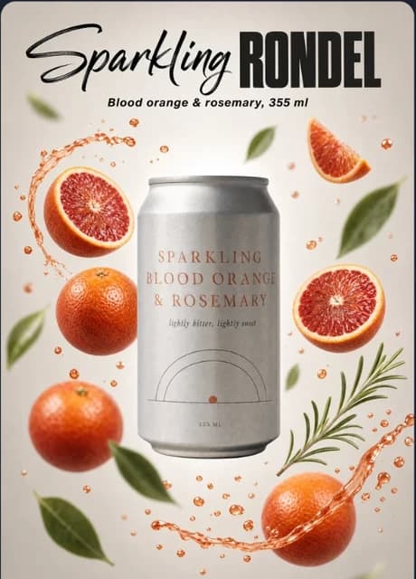
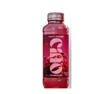

Look at what moved between the template and the result. The can became the bottle, obviously. But the citrus followed: the blood oranges of the original ad became lemons, because the imported product is a lemon kombucha. The headline was rewritten with the product name. The composition did not change: product in the centre, fruit bursting around it, headline at the top, plain background. That composition is what you “borrow”, because it has already proven itself.
Why it beats a prompt written from scratch
Describing an ad in text is an art director’s job: you have to name the focal length, the light, the typographic hierarchy, the balance of masses. Most people don’t have that vocabulary, and that is not a criticism: it isn’t their job. Picking from a gallery, on the other hand, everyone can do. You see what you want, you click, you get the same thing with your product.
The other advantage is predictability. A free prompt gives a different result every time. A template locks the structure: two successive generations stay in the same visual family, which lets you produce a consistent series instead of a pile of experiments.
The three families of ad visuals
Not every product ad serves the same place. Before choosing a template, ask yourself where the visual will be seen, and how long people will look at it.

The product alone, staged like a campaign: material, light, shadow. For brand image, the website, social media.
The product plus a headline, a tagline, sometimes an offer. For paid ads, where you must be understood in one second.
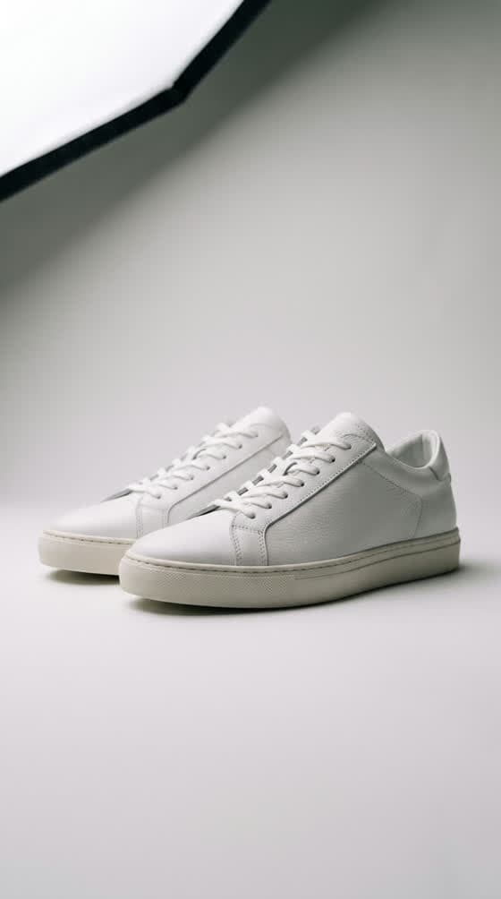
Neutral background, whole product, no distracting set. For Amazon, Etsy, an online store or a catalogue.
The product shot: selling a material
Nothing is written on the image. Everything rests on light and texture: refracting glass, matte cardboard, a drop of condensation. It is the visual that makes people want to touch it. It works on Instagram, as a product-page header, in a newsletter. It is also the most forgiving: with no text, there can be no typo.
The graphic ad: selling an idea in one second
In a feed, nobody reads: they skim. A graphic ad has to land its message before the thumb moves on. So it carries a very short headline, a very readable product and strong contrast. It is the best-performing family in paid advertising, and the most demanding to check, because every word counts.
The marketplace listing: reassuring
On a marketplace, the buyer compares. They want to see the whole product, from an honest angle, with no staging that misleads them on size or colour. Most marketplaces actually require a plain white background for the main image. It is the least spectacular visual and often the most profitable: it turns a visit into a purchase.
Preparing the source photo: the factor that decides everything
The model rebuilds everything except the product. Whatever it cannot see on your photo, it invents — and it invents it differently every time. The quality of the source photo is therefore the most important variable in the whole chain, well ahead of the choice of template.
The good news: “good photo” does not mean professional photo. The slider below shows the same display case, before and after going through the Studio. The starting photo is an amateur flash shot, crooked, full of reflections: the model turned it into a campaign image while keeping the same pastries in the same places.
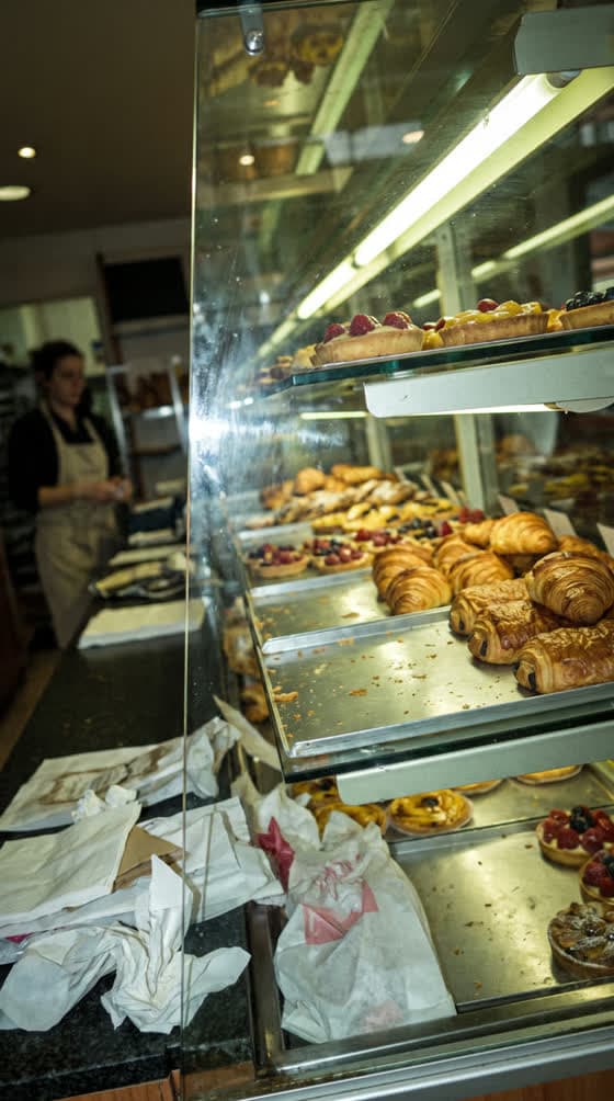
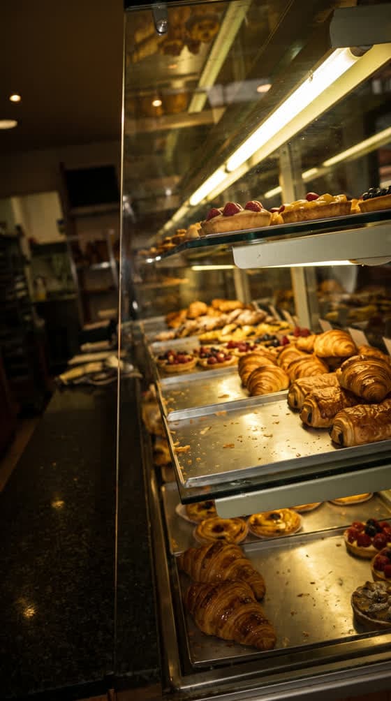
What was kept is what was visible and sharp in the snapshot: the shape of the pastries, their layout, the angle. Remember the rule: AI improves a mediocre photo, it does not repair an unreadable one.
The checklist before you upload
- Focus on the label. If you can’t read the brand name on the photo, neither can the model. Focus on the logo, not on the background.
- Soft, frontal light. Near a window, out of direct sun. No backlight: it drowns colours and edges.
- The whole product in frame. A cropped cap will be reinvented, rarely like the real one.
- A simple background. A white wall, a plain table. The background will be replaced, but a busy set blurs the line between product and surroundings.
- The angle of the target ad. If the template shows the product from the front, shoot it from the front. The model can rebuild a scene; it is much less reliable at rotating an object it has only seen in profile.
- No glare on the label. On glossy packaging, tilt the product slightly until the reflection leaves the text.
Cut out the background or not? Not needed for Workflow ADS: the product can be uploaded as is, on its original background. A clean cut-out sometimes helps for a very light product on a light background, where the edge gets lost.
The step-by-step method in ToolAcces
In the ToolAcces Studio, everything happens in the Workflow ADS tab. The gallery gathers several dozen ads sorted by family; each one can be “recreated” with your product.
- Browse the gallery and pick an ad
Filter by family. Choose for the composition first, not for the original product: a soda can ad can work perfectly for a jar of cream if you like the layout.
- Upload your product photo
It is the only required field. A sharp photo, whole product, readable label (see the checklist above).
- Describe your change, if needed
Optional field. Use it to change the headline, the mood colour, an element of the set. Left empty, the model adapts the ad to your product on its own.
- Choose the resolution
1K to test an idea (30 credits), 2K for the visual you will run (54 credits). The cost is shown before you launch.
- Launch and move on
Generation takes two to three minutes. The window closes right away: you can launch a second ad while the first one is being made.
- Collect the visual
It appears at the top of the Workflow ADS page and in your Studio gallery, where you can download it, edit it or animate it.
Writing the edit: what you can (and can’t) ask for
The change field is optional, but it is what turns a generic visual into one that speaks for your brand. The rule is simple: describe a difference from the chosen ad, not a whole scene. The composition is already there; don’t describe it again.
Changing the text
This is the most common use. Give the exact text, in quotes, and say where it goes. Keep it short: three to five words for a headline, that is what gets read in a feed.
Replace the headline with "CIAO KOMBUCHA" and the small line under it with "Lemon & ginger, 330 ml". Keep the same font style and position.
Adjusting the mood
Background colour, season, props: describe the change and restate what must not move. The last sentence of the example below is not politeness: it protects the product.
Change the background to a soft sage green and replace the citrus with fresh mint leaves and ice cubes. Keep the product, its label and the layout exactly the same.
What to avoid
- Describing the whole scene again. You clash with the template, and the model averages the two: neither one nor the other.
- Changing the product. “Make the bottle bigger” or “change the cap colour”: if the real product isn’t like that, the ad lies. Photograph the right variant instead.
- Stacking requests. One change per generation. If the result is off, you’ll know which one caused it.
- Long sentences on the image. A detailed promise belongs in the ad copy, not in the visual.
Why write in English? Image models understand other languages, but they were trained on far more descriptions in English. For staging instructions, English gives more faithful results. The text that must appear on the image, however, is written in your customers’ language.
Checking the result before running it
A generated visual should be looked at twice: once for pleasure, once as a suspicious customer. The second look is the one that matters. Here is the order to check in.
- The label. Put the real product next to the screen. Name, logo, colours, label proportions: everything must match. A customer who receives a product different from the ad doesn’t come back.
- The added text. Read every word, letter by letter. Models have made huge progress, but a doubled letter in a proper name is still possible. It is the mistake that instantly gives away an ad “made by AI”.
- Proportions. Is the product the right size compared to what surrounds it? A 330 ml bottle that looks a metre tall, or a perfume bottle that fits in a thimble, is a fairness problem.
- Hands and secondary objects. If there is a hand, count the fingers. If there is fruit, check it looks like fruit.
- Stray brands. A model can make a logo appear that looks like another brand’s, on an object in the set. Regenerate without hesitation.
If a single point is off, regenerate rather than retouch: at two to three minutes per generation, getting a new version is often faster than fixing the old one. Our article on deformed hands and unreadable text explains where these defects come from and how to avoid them.
Adapting: one visual, every placement
An ad never lives in a single format. The same message has to fit a square feed post, a vertical story and a product page. The classic trap is to generate a square and crop it afterwards: you lose the headline, or the top of the product.
| Placement | Format | What matters |
|---|---|---|
| Instagram / Facebook feed | 4:5 or 1:1 | 4:5 takes more screen space; headline in the top third. |
| Stories, Reels, TikTok | 9:16 | Keep the top and bottom clear, they are covered by the interface. |
| Marketplace listing | 1:1 | Plain white background, whole product, no promotional text. |
| Website banner, newsletter | 16:9 or wider | Off-centre product to leave room for HTML text. |
The simplest approach: pick an ad in the gallery that is already in the right format for the placement, rather than adapting it afterwards. For vertical safe zones in detail, see which format to choose for TikTok, Reels and Shorts.
Testing like a brand that spends on ads
The real gain of generation is not making one beautiful ad. It is being able to make five very different ones and letting the numbers decide. Successful advertisers don’t guess which visual will work: they test.
 Mood
Mood Material
 Minimal
 Contrast
What to vary
- The message angle: taste, price, ingredient, moment of use. It is the variable that moves results the most.
- The visual family: pure product shot versus graphic ad with headline.
- The mood: coloured background versus lifestyle set.
What is pointless to vary: the exact shade of the background or the headline size to the pixel. Those differences are too fine to show up in the results of a small-budget campaign.
A realistic pace
For a small brand, a sustainable pace is four to six new visuals per product per month: cut the underperformers after one to two weeks, keep the best one, and produce new variations around it. With 2K visuals, that is a few hundred credits per product per month — compare that with the cost of a single shoot.
Going from image to video
Vertical formats favour video, and a successful ad visual makes an excellent starting image. The principle: give the image to a video model and describe a single movement.
The movements that work best on a product are slow: a push-in, a highlight crossing the glass, a shadow moving across. Spectacular camera moves (full orbits, drone shots) often distort the product. Everything is detailed in how to turn an image into a video with AI.
Seven mistakes that give away a generated ad
- A typo in the brand name. Spotted instantly, instantly read as “rushed”.
- A product that isn’t quite yours. A cap in another colour, a simplified label. The customer will notice on delivery.
- Skin or materials that are too smooth. The “plastic” look is the visual signature of images generated without care.
- Too much text. An ad that takes ten seconds to read won’t be read.
- A set unrelated to the product. Lemons around a cherry soda: the customer’s brain checks out.
- The wrong format. A square visual stretched into a story, headline cut off.
- A single version. Without testing, you can’t know if the visual is good or merely pleased its author.
The legal framework in two minutes
An AI-generated ad is still an ad: consumer protection law applies exactly as it does to a regular photo. The visual must not mislead on the product’s size, colour, composition or effect.
Since August 2, 2026, Article 50 of the EU AI Act also imposes transparency obligations on certain generated content. Ad platforms have their own labelling rules for AI-created content as well. To know what applies to you, read what the AI Act changes for your creations and can you use an AI image commercially.
Good habit: only use photos of products you actually sell, and keep your source files (original photo, generated visual, date). They are your best proof of good faith if questions come up.
Frequently asked questions
No. A phone photo is enough, as long as it is sharp, well lit and the label is readable. The model rebuilds the lighting, the set and the layout; it cannot invent a detail it cannot see. A blurry or backlit shot gives an approximate product, whatever template you choose.
Each Workflow ADS visual costs 30 credits at 1K and 54 credits at 2K, taken from the Studio credits included in your subscription. The cost is shown before you launch the generation, and a generation that fails is refunded.
Not always. Image models write far better than two years ago, but a long word, a discount with numbers or an unusual brand name can still come out with an extra letter. Read every word before running the ad, and prefer short headlines you can check at a glance.
Yes, that is what they are for. Just make sure the visual promises nothing the product doesn't deliver, follow the platform's rules on AI-generated content, and keep your source files. Our article on the commercial use of AI images covers the legal precautions.
A regular generation starts from text: you describe everything, the scene, the light, the composition. Workflow ADS starts from an existing ad whose staging has already proven itself, and puts your product into it. You choose instead of describing, which is much faster when you are not an art director.
Yes. The visual lands in your Studio gallery and can be used as the starting image for a video model such as Kling. A simple movement, a slow push-in or a highlight sliding across the product, works far better than a complex action.